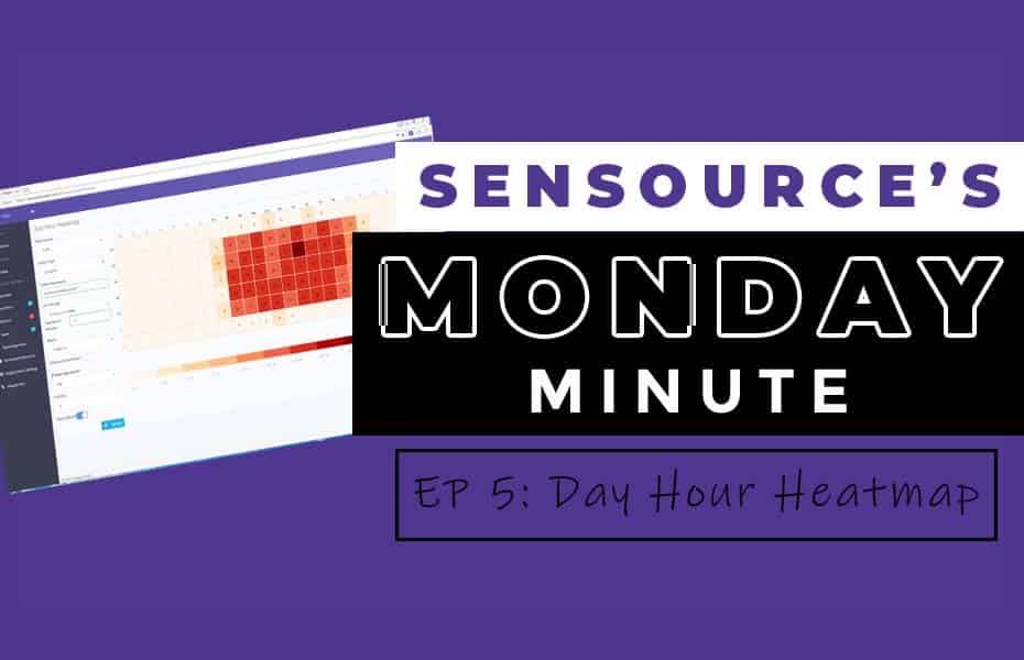
The Day-Hour Heatmap is a type of report that doesn’t take long to digest, yet can provide immense value and guidance on critical decisions like employee scheduling, hours of operation, and peak vs. non-peak times
Any client that has made the decision to implement a SenSource People Counting system understands the power of collecting foot traffic data. But like any data point, foot traffic data is only as powerful as the information and reporting it conveys. At our core, SenSource is a data and analytics company and our goal is to provide clients with decision making metrics that make sense for their businesses.
The Day-Hour Heatmap in Vea, our reporting platform, is a type of report that doesn’t take long to digest, yet can provide immense value and guidance on critical decisions like employee scheduling, hours of operation, and peak vs. non-peak times.
Let’s dive into the Day Hour Heatmap and see what we can learn: Watch the video here.
What does the report show?
The Day Hour Heatmap allows you to view your average data for a specified time span, which the user dictates. It can be day, week, month, quarter, or whatever specific amount of time you’d like to see.
Once the heatmap is generated, the data is categorized in bins by day & hour. It allows you to quickly see your busiest and slowest times throughout the week of a the time period specified.
Suddenly you can identify time periods where you are understaffed. Or maybe figure out there are times at the beginning or end of the shifts where you receive minimal traffic, which could allow you to reduce operating hours.
Another great application is to have a visual of museum visitor counts. Knowing the flow of visitors by the hour each day helps to schedule staff and events.
The Report with Staying Power
The more you utilize this report, the more valuable the data becomes. One extra tip we highly recommend is picking a certain amount of time, 6 weeks for example, and schedule the day-hour heatmap to deliver to your email automatically.
If you’d like to learn how to schedule automatically emailed reports, watch our video.

