
Custom Date Range Reporting
November 6, 2023
Unlock opportunity with customer counting
Make data-driven decisions to grow your library
Evaluate space utilization metrics
Communicate ride wait times and improve guest experience
Count, analyze, and control museum flow
Automate guest counting at your casino
Monitor attendance at your church services
Limit access to paying members and track gym usage
Track road usage with car counter options
We think Paolo Magrassi from Gartner said it best when he said “If you torture your data set enough, it will confess anything.” Like any large data sets, foot traffic data collected by a people counting sensor over an entire year can be sizeable and intimidating. However, by using SenSource’s Vea Software, creating useful and impactful end of the year foot traffic reports has never been easier.
Here are three end of year foot traffic reports we think you will find useful, and how to quickly generate them:
One of Vea’s best features is the pre-configured widgets that give you crucial information that continues to update as data is collected. While very straightforward, a 2023 vs 2024 comparison widget gives immediate insight into how you are performing compared to last year.
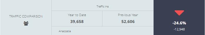
This widget can be added by clicking the add widget button, selecting comparison, and then configuring the widget to compare year vs. year.
Vea’s day-hour heatmaps are a highly visual way to consume a large amount of data quickly. One ideal end of the year report is a Year-to-Date Average Max Occupancy by Hour Heatmap. This takes a measurement of every day’s high occupancy measurement by hour and averages it across the year. You can learn, on average, what your peak occupancy was by hour to help establish a solid foundation for scheduling for the coming year.
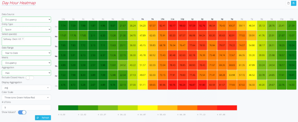
This report can be generated by navigating to Data Views then Heatmap. You can then input the selections shown in the image above (plus inputting your specific space).
Many inferences can be made from this sample Data Grid. As expected for a grocery store, the busiest days of the week are Saturday and Sunday, depicted by the longest stretch of red hours on the grid. Monday is the busiest weekday. Among all days of the week, 1:00 pm is the busiest single shopping hour, with heaviest traffic occurring between the hours of 11 am to 2 pm. The day-hour heatmap is an ideal report for planning staff schedules. It’s quickly evident that a schedule for Tuesdays, the slowest day of the week, should look different than a staff schedule for Monday. In addition, operational duties can be streamlined using the grid to find the slowest hours of the week to schedule deliveries, vendor meetings and store maintenance. As an end of year report, the grid may uncover big-picture items to consider such as adjusting open hours to reflect shopper habits or planning promotions to boost slower days.
While not as visually appealing, the data grid option in Vea is the ideal report format for those who enjoy working in Excel. Having the data in columns and rows lets users create their own reporting and charts in ways that make sense for them. A Last-Year-by-Month report in a data grid format gives insights into how busy you were by month and extrapolates that to compare against promotions you were running at that time. But again, in data grid format, you can manipulate the data as you see fit to help you learn and make conclusions about the previous year.
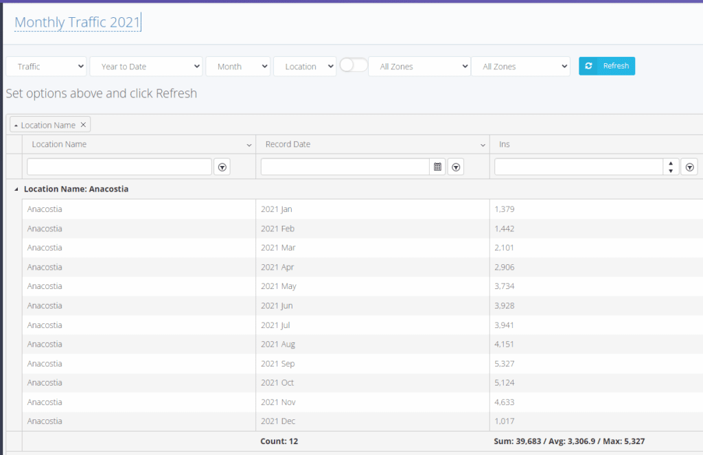
This report can be generated by navigating to Data Views then Data Grid. You can then input the selections shown in the image above (plus inputting your specific space).
Data reporting beauty is in the eye of the beholder. Vea remains flexible enough to allow the users to dictate what data they want to see and how they see it. Every organization can vary in how they use their foot traffic reports. But we recommend starting with these end of the year reports to set up your team for many successes in 2025!